Creating a Lightweight Design System
to Streamline Workflow
and Strengthen Brand Consistency
Overview
As an art director of my department, I led the creation of a design system to support a small team of designers working across a high volume of digital marketing assets.
This design system helped streamline our workflow, reduce rework, and significantly improve brand consistency across platforms.
The Challenge
Without a shared design language, each designer interpreted brand elements slightly differently—and often started new pages or layouts from scratch instead of repurposing existing patterns.
Core elements like buttons, banners, and modules would vary in style, hierarchy, or spacing depending on who created them.
This led to slowed production, increased rounds of review, and a lack of cohesion across campaigns.
The Process
I began by auditing commonly used assets to identify visual patterns and inconsistencies. I worked closely with our team to prioritize the foundational components that caused the most confusion.
I managed our junior designer in creating the shared library, guiding the labeling and documentation of each component to ensure clarity. For rollout, I presented the system in a team workshop and integrated it into our weekly production workflow, reinforcing adoption and feedback loops.
Inconsistent font weight
Mismatched buttons

System Highlights
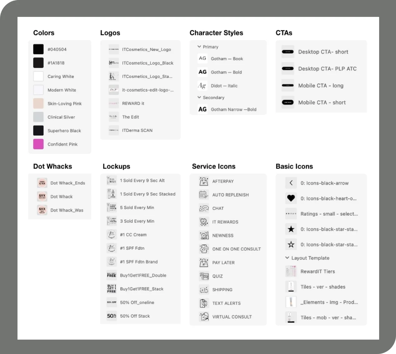
Typography: Standardized hierarchy for headers, subheads, and body copy
Logos: Approved lockups with clear usage rules
Icons: Commonly used brand and system icons in a consistent style
Buttons: Primary and secondary button styles with hover and padding specs
The system was intentionally lightweight, focusing on high-impact, frequently reused elements:
Color Palette: Core brand colors, neutrals, and accent tones with hex values
Grids: Modular grid system for digital ads, landing pages, and social
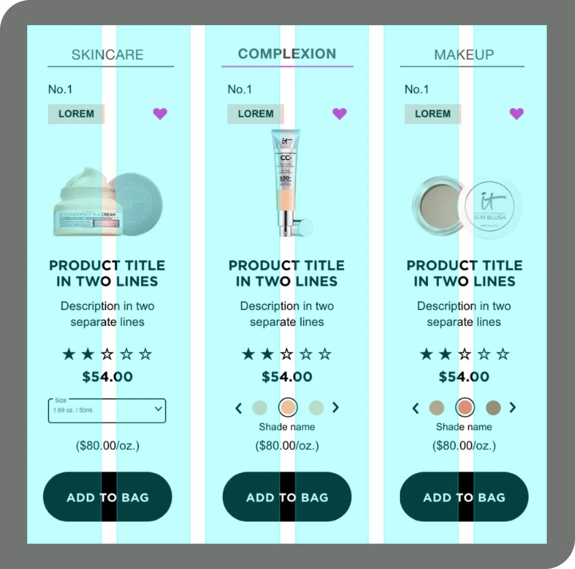
Templates: Pre-built frames for top-performing formats to accelerate production
Impact
After rollout, the design system led to faster, more aligned production. Overall asset creation time decreased
The number of live reviews reduced from 2 to 1. This removed a recurring meeting for 2-3 departments.
Designers spent less time second-guessing choices and more time refining creative.
The system was also adopted by our external design partners. Project kickoff meetings went from 1.5-2 hour to 25-35 minutes.
Revised Category tiles with uniform lockup typography and standardized CTA