Helping Customers Find
Their Ideal Foundation Match
Overview
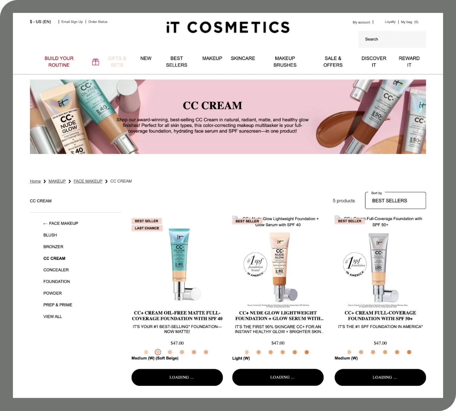
CC+ Cream is the brand’s #1 best-selling product and comes in four finishes, each suited for different skin types and coverage preferences.
Over time, this product line expanded, but the landing page didn’t evolve with it. The goal was to help users quickly understand the differences between each formula and guide them to add to bag, or navigate to the product detail page for more information.
I led the UX and visual design for this update, collaborating with the D2C site manager. I used Figma, stakeholder interviews, and customer feedback data to inform my decisions.
The Challenge
The original landing page featured a generic banner that briefly named each formula, but provided no meaningful comparison. All four finishes were shown together without visual or contextual cues to help a new customer decide.
This lack of clarity led to:
Customer confusion
Increased bounce rates
Trial-and-error shopping behavior that could be avoided
The challenge was to create a comparison experience that was:
Easy to scan
Intuitive for first-time buyers

The Process
I evaluated several competitive examples; the one below is from a sister brand, so the configuration is already enabled in our content management system. noting how the close-up imagery effectively clarified product differences.
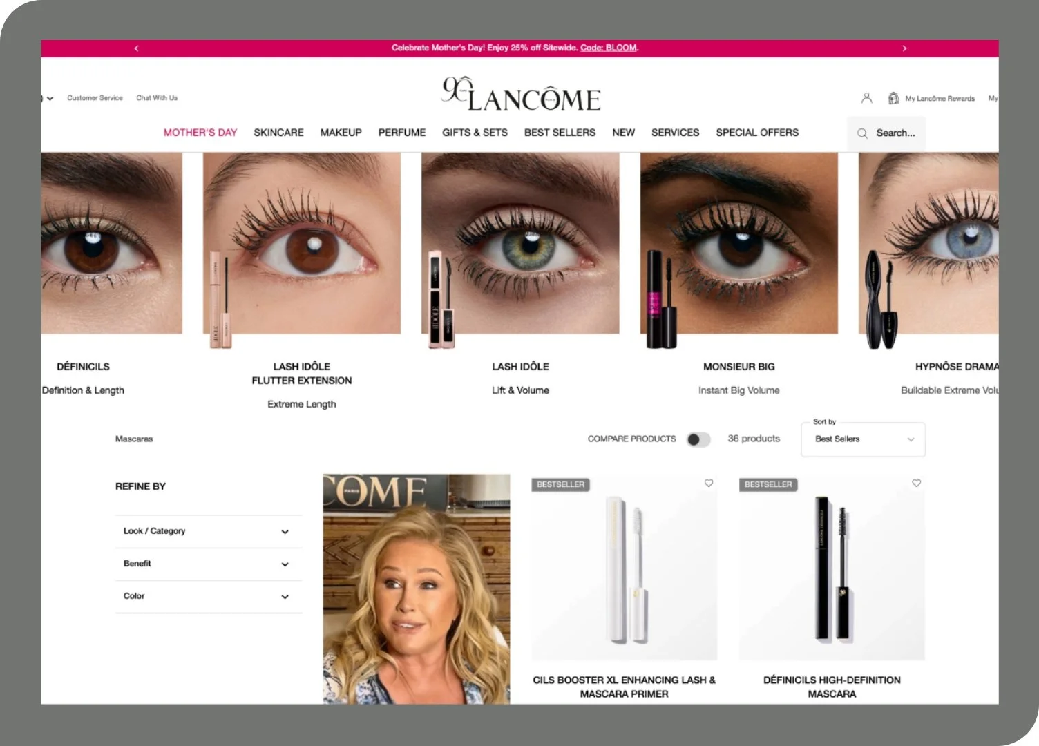
While compelling, this approach didn’t translate well to CC+ Cream:
Our product has no unique applicator
All four formulas appear nearly identical when swatched
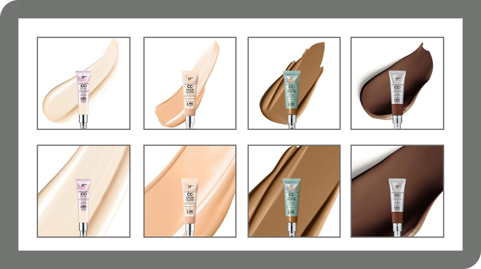
To demonstrate the mismatch, I created a mockup based on the reference above.
I explored six layout variations to solve for multiple user needs and business goals.
Each concept experimented with different content hierarchies, visual density, and interaction models.
A few key considerations shaped these iterations:
Consistency with the brand’s visual style; it is always preferred to show a texture swatch with the primary packaging.
Packaging visibility: The tubes are slightly different in shape and labeling, so we wanted to highlight the packaging to help returning customers recognize their preferred formula at a glance.
A key requirement was a column-based layout that could link directly to each product detail page. This constraint shaped all six iterations.
Shade range communication: Each formula has a different number of available shades. Some iterations emphasized range diversity to help customers understand the level of inclusivity and product fit.
Text vs. visual balance: Some concepts leaned more into visual comparison using swatches and icons, while others tested short feature blurbs for first-time buyers who needed more context. The final version included clear, concise text descriptions to support screen readers and improve accessibility, ensuring that key differences were understandable even without visual cues.
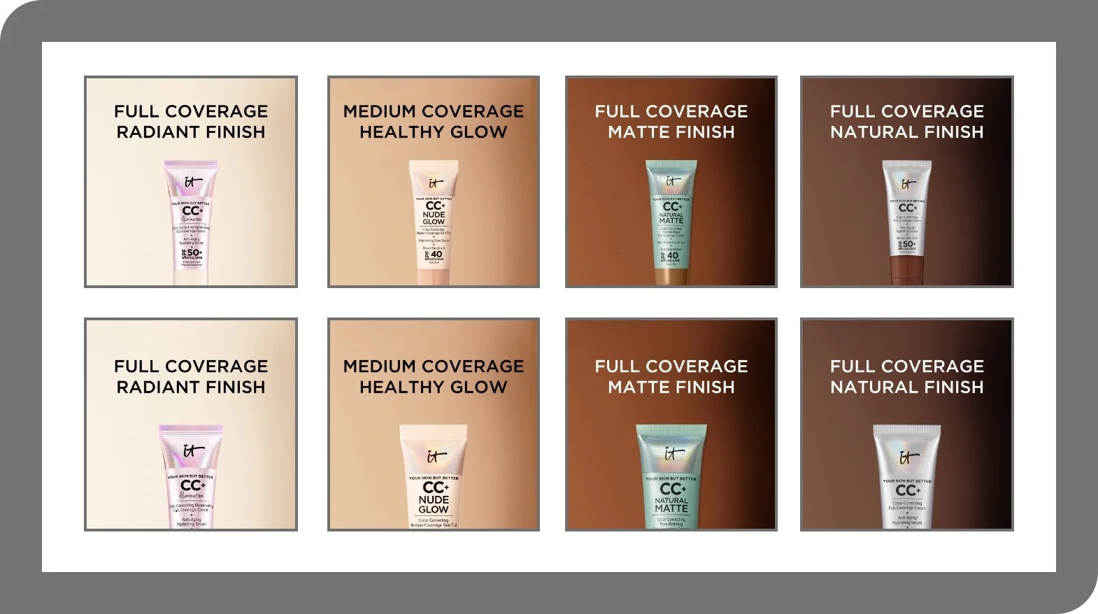
Interaction style: I tested both scrollable horizontal modules and static grid layouts to evaluate which supported quicker scanning and easier product selection.
Mobile adaptability: All concepts were designed with mobile-first thinking. I evaluated how each version would collapse or stack on smaller screens, prioritizing tap targets and visual clarity.
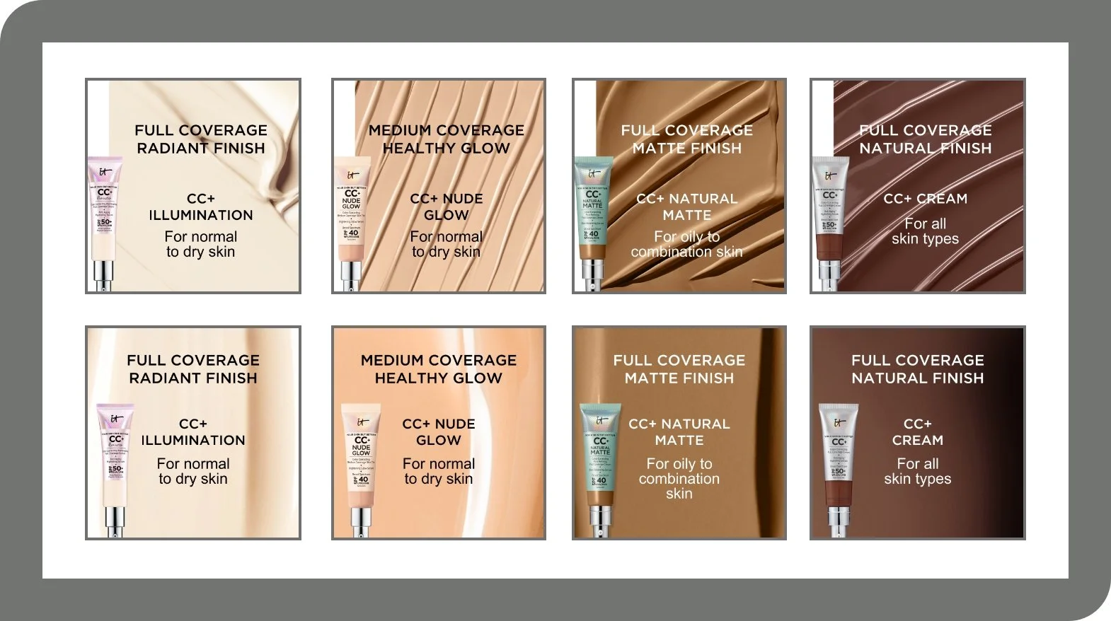
Final Design
The final layout is a four-column horizontal comparison block, placed directly below the category hero banner.
This structure balanced visual storytelling with utility. Critically, it also allowed each formula's shade range to be visible at a glance — an intentional choice given the ongoing industry scrutiny around shade inclusivity. For a brand whose customers actively evaluate shade range before purchasing, this wasn't a visual detail, it was a trust signal.
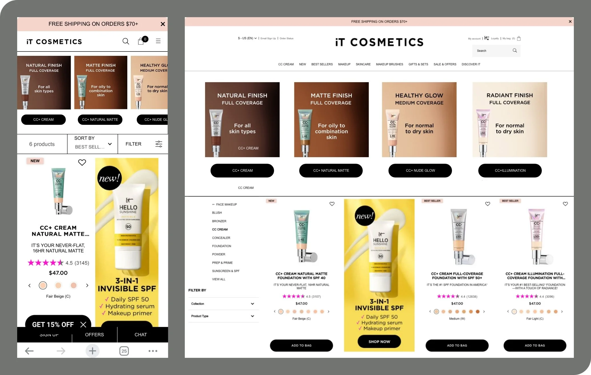
Each column includes:
A background swatch showing the texture and finish of the product
A full tube of the formula centered in the frame
A brief headline that includes:
The formula name
A key differentiator (e.g., oil control, glow)
The targeted skin type
This allowed customers to:
Quickly scan the differences
Click directly to the product detail page of the formula best for them
Scroll down to add their preferred shade to cart from the category page
Impact
The D2C team requested the layout be adapted for the blush category page — validating the approach as a scalable model for future category experiences. Early engagement data showed increased click-through to product detail pages and improved conversion behavior.